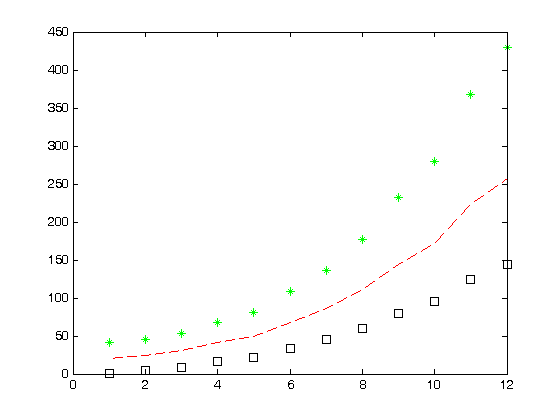
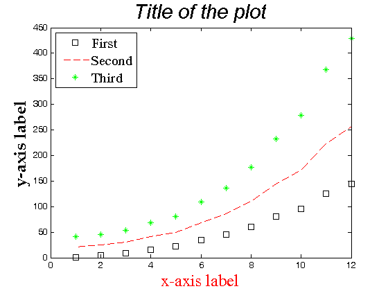
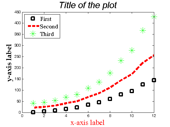
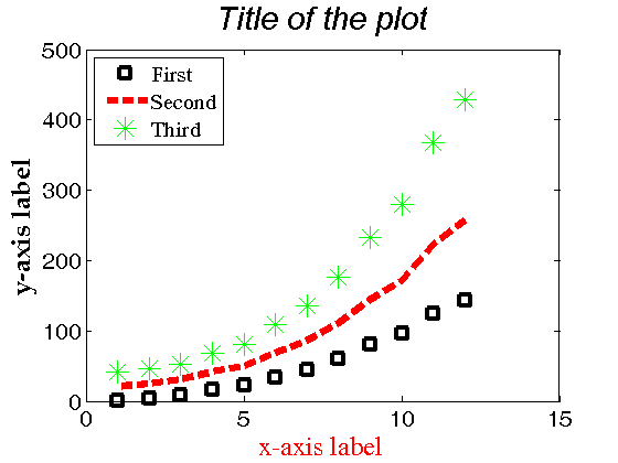
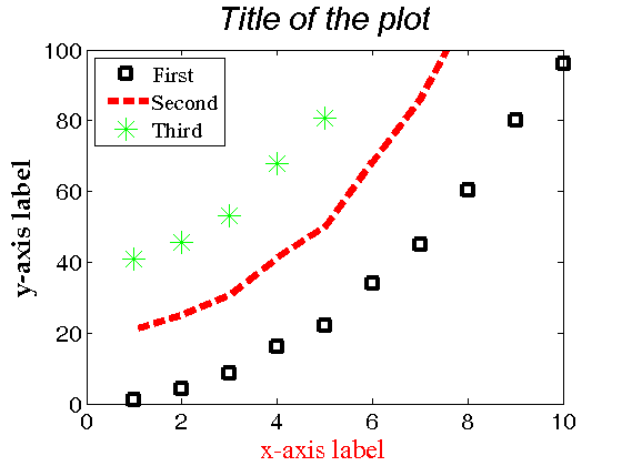
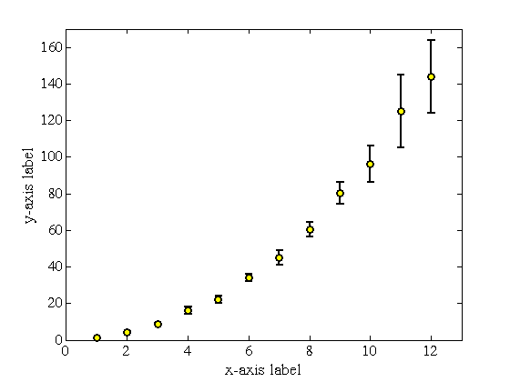
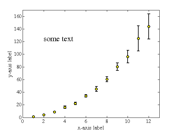
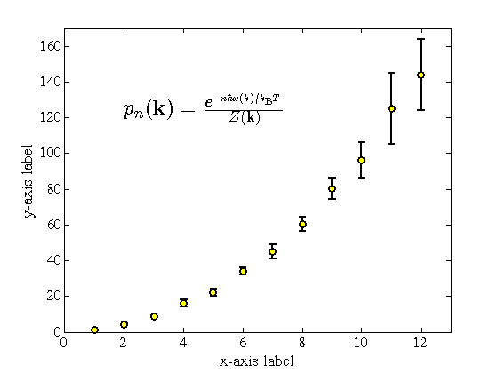
% Jake Bobowski
% August 17, 2017
% Created using MATLAB R2014a

% This tutorial will demonstrate how to create basic plots of data and
% functions.

clearvars

% Below is an example dataset with x and y values.
x = [1, 2, 3, 4, 5, 6, 7, 8, 9, 10, 11, 12];
y = [1.02, 4.3, 8.6, 16, 22, 34, 45, 60.2, 80.1, 96, 125, 144];

% Here's the simplest possible plot of y vs x.  When you run this script
% and new window will appear showing this plot.
plot(x, y)

% Of course, there are lots of options that can be used to better format
% the plot.  Before we get to those options, let's clarify an important
% point.  If we were to execute another plot command, it would overwrite
% the plot that was we created just a moment ago.  To tell MATLAB that we
% want a second plot window to appear, we must first use the command
% 'figure()'
figure();

% Now let's do some formating.  I will not attempt to show you all of the
% possible plot options -- you can check the online MATLAB documentation
% yourself.  I'll just show you some of the basics.

% You can make line plots or scatter plots.

% scatter plot point types:
% o - circle
% + - plus sign
% * - asterisk
% . - point
% x - cross
% s - square
% d - diamond
% ^ - up-pointing triangle
% v - down-pointing triangle
% > - right-pointing triangle
% < - left-pointing triangle
% p - pentagram
% h - hexagram

% line plot line types
% -     solid line (default)
% --    dashed line
% :     dotted line
% -.    dash-dot line

% point/line colours
% y - yellow
% m - magenta
% c - cyan
% r - red
% g - green
% b - blue
% w - white
% k - black

% Here's a point plot using square symbols that are black.
plot(x, y, 'ks')

% We can use the 'LineWdith' option to adjust the thickness of the line
% used to draw the point and we can use 'MarkerSize' to adjust the overall
% size of the point.
figure();
plot(x, y, 'ks', 'LineWidth', 2.5, 'MarkerSize', 12)

% You can put multiple plots in the same plot command and format each of
% them differently
figure();
plot(x, y, 'ks', x, y.^1.1 + 20, 'r--', x, y.^1.2 + 40, 'g*')

% To add axis labels, plot title, and a legend, you can use simple
% commands that follow the plot statement.  I've included some formating
% options just to show how they work.  Notice the option in 'legend'
% used to position the legend in the top-left corner (I don't know why they
% thought northwest was better than topright).
figure();
plot(x, y, 'ks', x, y.^1.1 + 20, 'r--', x, y.^1.2 + 40, 'g*')
xlabel('x-axis label', 'FontSize', 18, 'FontName', 'Times', 'Color', 'r')
ylabel('y-axis label', 'FontSize', 18, 'FontName', 'Palatino', 'fontweight', 'b')
title('Title of the plot', 'FontSize', 22, 'FontName', 'Arial', 'FontAngle', 'italic')
legend({'First', 'Second', 'Third'}, 'FontSize', 15, 'FontName', 'Times', 'location', 'northwest')

% Note that, when you have multiple curves in the same plot statement, you
% can't adjust the line thicknesses and point sizes like we did in the
% example above.  The four lines at the end of this block of code show
% way to do it.  To use this method, you have to call the plot something
% (plot1 is used in the example below).
figure();
plot1 = plot(x, y, 'ks', x, y.^1.1 + 20, 'r--', x, y.^1.2 + 40, 'g*');
xlabel('x-axis label', 'FontSize', 18, 'FontName', 'Times', 'Color', 'r')
ylabel('y-axis label', 'FontSize', 18, 'FontName', 'Palatino', 'fontweight', 'b')
title('Title of the plot', 'FontSize', 22, 'FontName', 'Arial', 'FontAngle', 'italic')
legend({'First', 'Second', 'Third'}, 'FontSize', 15, 'FontName', 'Times', 'location', 'northwest')
set(plot1(1), 'LineWidth', 3)
set(plot1(2), 'LineWidth', 5)
set(plot1(1), 'MarkerSize', 10)
set(plot1(3), 'MarkerSize', 15)
% What a hideous looking plot!

% We can also format the tick labels.  I don't know why 'gca' is used to
% refer to the tick labels.
figure();
plot1 = plot(x, y, 'ks', x, y.^1.1 + 20, 'r--', x, y.^1.2 + 40, 'g*');
xlabel('x-axis label', 'FontSize', 18, 'FontName', 'Times', 'Color', 'r')
ylabel('y-axis label', 'FontSize', 18, 'FontName', 'Palatino', 'fontweight', 'b')
title('Title of the plot', 'FontSize', 22, 'FontName', 'Arial', 'FontAngle', 'italic')
legend({'First', 'Second', 'Third'}, 'FontSize', 15, 'FontName', 'Times', 'location', 'northwest')
set(plot1(1), 'LineWidth', 3)
set(plot1(2), 'LineWidth', 5)
set(plot1(1), 'MarkerSize', 10)
set(plot1(3), 'MarkerSize', 15)
set(gca, 'FontSize', 16, 'FontName', 'Helvetica')

% Finally, you can also set the ranges of the x- and y-axes.
% Use axis([xmin xmax ymin ymax]) to do this.
figure();
plot1 = plot(x, y, 'ks', x, y.^1.1 + 20, 'r--', x, y.^1.2 + 40, 'g*');
xlabel('x-axis label', 'FontSize', 18, 'FontName', 'Times', 'Color', 'r')
ylabel('y-axis label', 'FontSize', 18, 'FontName', 'Palatino', 'fontweight', 'b')
title('Title of the plot', 'FontSize', 22, 'FontName', 'Arial', 'FontAngle', 'italic')
legend({'First', 'Second', 'Third'}, 'FontSize', 15, 'FontName', 'Times', 'location', 'northwest')
set(plot1(1), 'LineWidth', 3)
set(plot1(2), 'LineWidth', 5)
set(plot1(1), 'MarkerSize', 10)
set(plot1(3), 'MarkerSize', 15)
set(gca, 'FontSize', 16, 'FontName', 'Helvetica')
axis([0 10 0 100])

% So far, everything has been done for a simple x vs y plot of data.
% In physics will often want to add error bars to our plots.  Below are
% some error bar values and a plot with error bars.  Instead of 'plot', we
% use 'errorbar'.  I also threw in another option to colour the inside of
% the marker yellow.
dy = [.3, .3, .5, 2, 2, 2, 4, 4, 6, 10, 20, 20];
figure();
errorbar(x, y, dy, 'ko', 'MarkerSize', 6, 'LineWidth', 1.5, 'MarkerFaceColor', 'y')
xlabel('x-axis label', 'FontSize', 14, 'FontName', 'Times')
ylabel('y-axis label', 'FontSize', 14, 'FontName', 'Times')
set(gca, 'FontSize', 12, 'FontName', 'Times')
axis([0 13 0 170])

% I can't resist showing one more option.  Suppose you wanted to add text
% to you plot, maybe somewhere where there's a lot of white space.  You can
% use text(x-coordinate, y-coordinate, 'text') to do just that.
figure();
errorbar(x, y, dy, 'ko', 'MarkerSize', 6, 'LineWidth', 1.5, 'MarkerFaceColor', 'y')
xlabel('x-axis label', 'FontSize', 14, 'FontName', 'Times')
ylabel('y-axis label', 'FontSize', 14, 'FontName', 'Times')
set(gca, 'FontSize', 12, 'FontName', 'Times')
axis([0 13 0 170])
text(2, 125, 'some text', 'FontSize', 18, 'FontName', 'Times')

% What if the text you wanted to add is some complicated symbollic
% expression?  Those of you that a familiar with entering in equations in
% LaTeX will love this.  MATLAB has a LaTeX interpreter.  See the last line
% in the block of code below to see how to use it.  Note that you can use
% the LaTaX interpreter in axis labels and plot titles too.
figure();
formattedPlot = errorbar(x, y, dy, 'ko', 'MarkerSize', 6, 'LineWidth', 1.5, 'MarkerFaceColor', 'y');
xlabel('x-axis label', 'FontSize', 14, 'FontName', 'Times')
ylabel('y-axis label', 'FontSize', 14, 'FontName', 'Times')
set(gca, 'FontSize', 12, 'FontName', 'Times')
axis([0 13 0 170])
text(2, 125, '$p_n(\mathbf{k})=\frac{e^{-n\hbar\omega(k)/k_\mathrm{B}T}}{Z(\mathbf{k})}$', 'Interpreter', 'LaTeX', 'FontSize', 18, 'FontName', 'Times')

% The LaTeX text generated in the pop-up window that MATLAB produces will
% look terrible.  However, if you export the figure to an .eps format
% (encapsulate postscript) it will look sharp!
saveas(formattedPlot, 'formattedPlot.eps', 'epsc');

% Maybe you think that the .eps file format is inconvenient (it's not,
% btw).  Never fear because one fine member of the MATLAB community has
% created a MATLAB function to convert the eps file to a pdf while
% maintaining good resolution.  The MATLAB command below initiates the
% conversion.  For this to work, you must have eps2pdf.m and the .eps file
% in the same directory as the script that you're working in.  You can
% download eps2pdf.m from the same website that you found this tutorial.
eps2pdf 'formattedPlot.eps';

% It is also possible to save the plot as a jpg (or tiff or bmp or png).
% However, the result is NOT good.  First, the LaTeX expression will look
% terrible.  Even tick labels and axis labels will look bad with even a
% modest amount of zooming in.  The eps format, however, is a vector
% graphics format so that image still looks great even at very high levels
% of zoom.  Here's how the jpg is created if you need to see it for yourself.
saveas(formattedPlot, 'formattedPlot.jpg');
pdf successfully created